Saul Bass: Cover Design Study
This project explores book cover design through a visual study inspired by Saul Bass and his bold graphic language. The goal was to capture the clarity, movement, and visual impact associated with his work while translating those qualities into a contemporary cover composition. Through strong typography, simplified imagery, and a limited color palette, the design aims to reflect Bass’s influence on film, design, and visual communication.
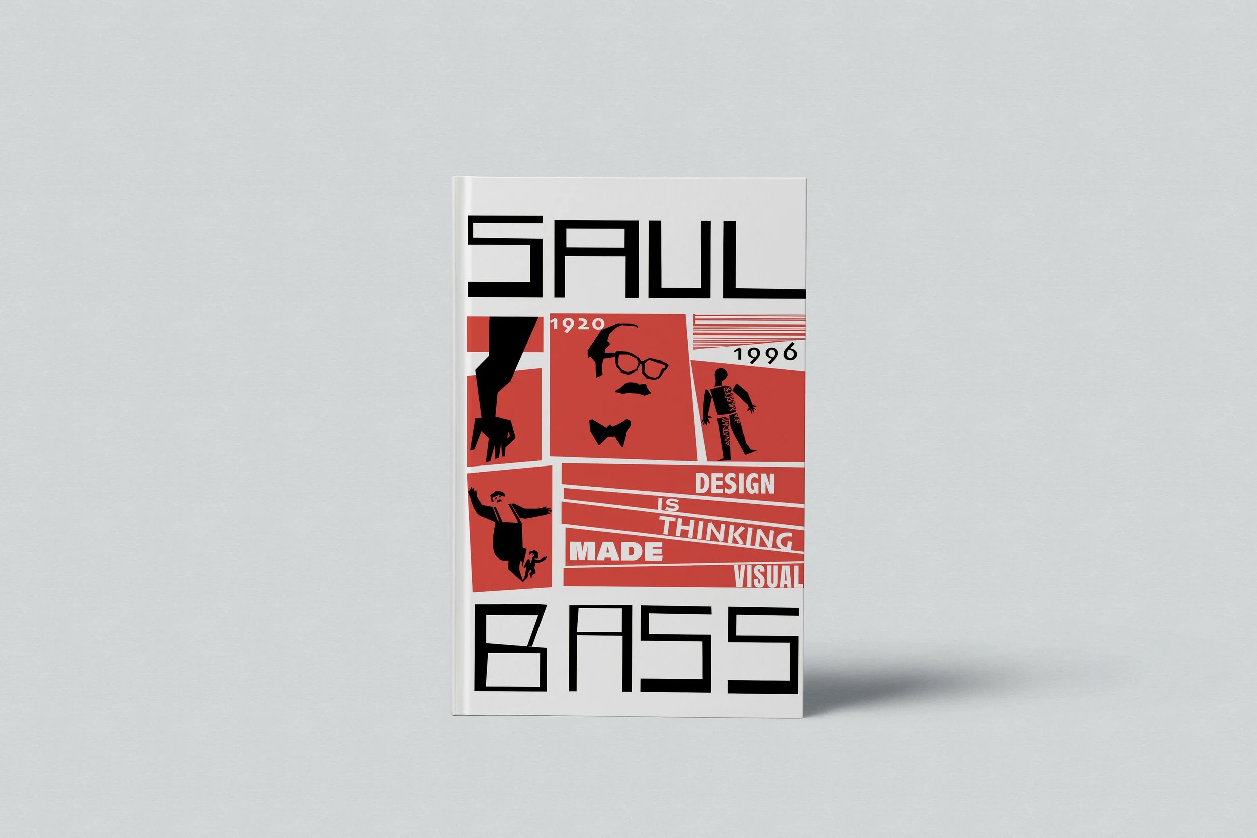
Design Direction
The cover was developed around key qualities associated with Saul Bass, including simplified forms, strong contrast, graphic reduction, and dynamic composition. A modular layout was used to organize imagery and text into bold visual units, helping the design feel structured while still energetic and expressive.
Typography
Typography plays a central role in the composition, echoing Saul Bass’s use of bold letterforms and strong hierarchy. Large-scale type was treated as both information and image, helping create rhythm, contrast, and a sense of movement across the cover.

Color Palette
A limited palette of red, black, and white was used to create immediacy and visual contrast. These colors reference the bold, high-impact quality often associated with Saul Bass’s poster and title work while keeping the composition clear, graphic, and memorable.