Matcha Strawberry Promotional Campaign
This project explores promotional social media design through a seasonal Strawberry Matcha campaign for Gong cha. The goal was to create eye-catching mobile advertisements that highlight flavor, freshness, and product appeal while remaining clear and engaging in a fast-scrolling digital format. Two visual directions were developed to compare a more descriptive promotional layout with a cleaner editorial approach.
Typography & Visual Language
Typography Choices
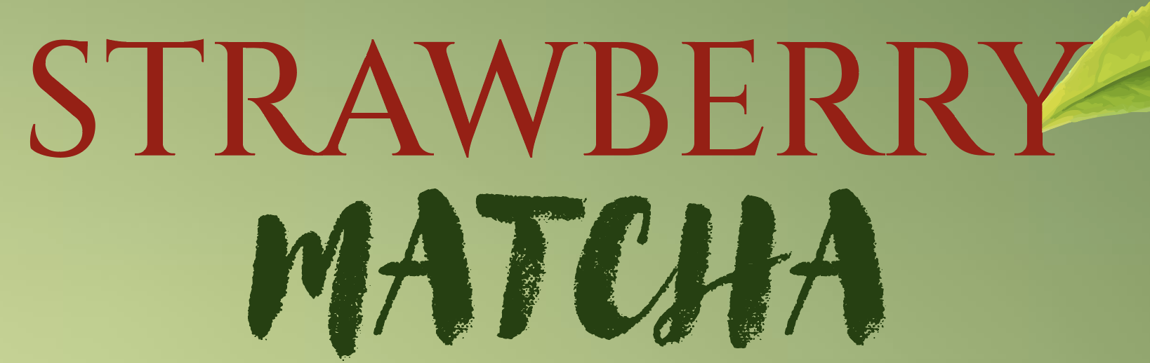
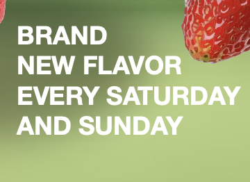
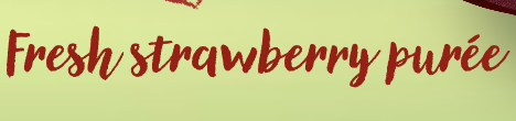
The campaign combines expressive and structured typography to create contrast and emphasis. A more energetic display style was used to highlight the flavor names, while simpler supporting text keeps the promotional details clear and readable. Differences in scale, placement, and orientation help create hierarchy and guide the viewer’s eye through the composition.
Color Palette & Imagery
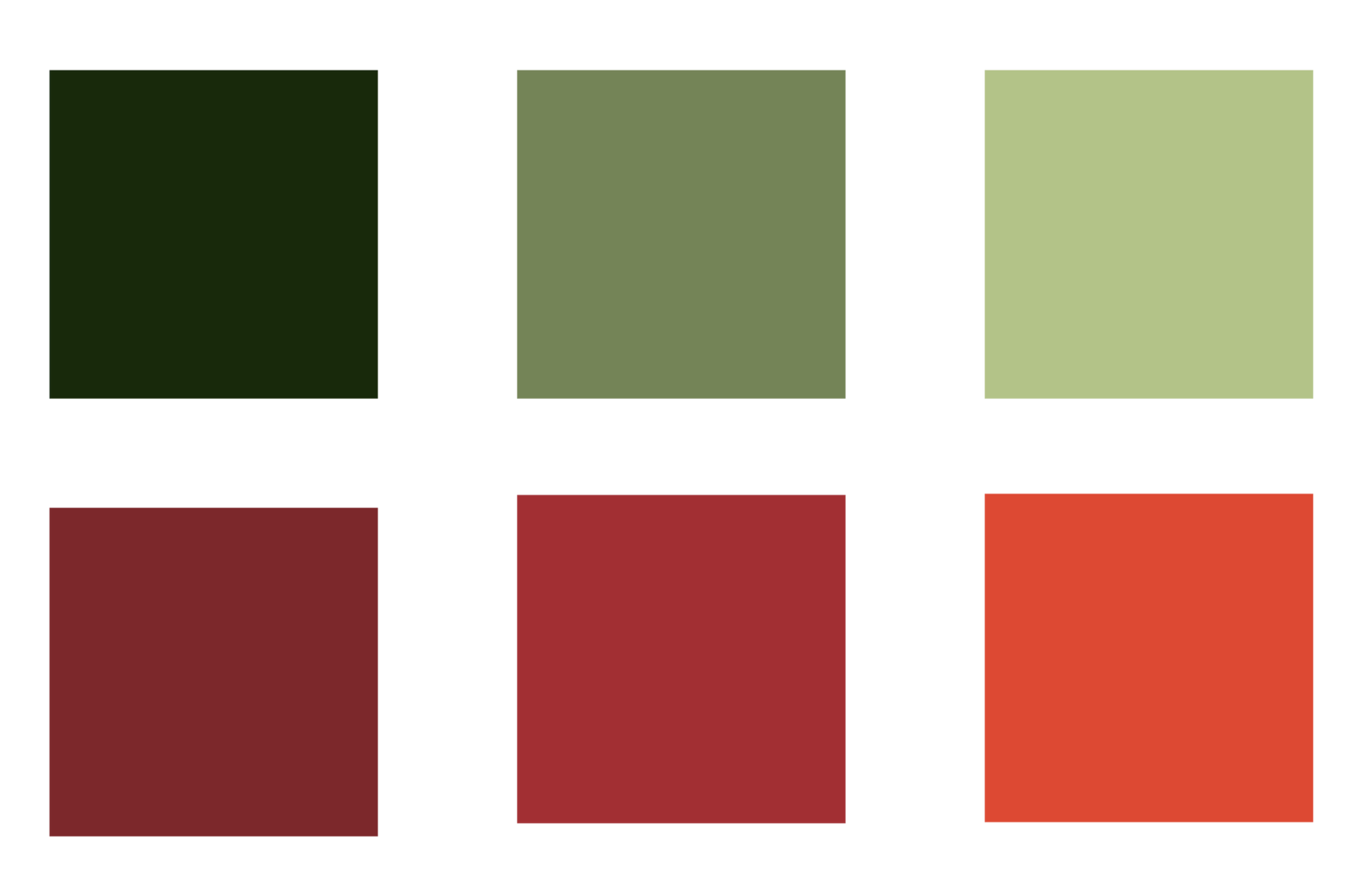
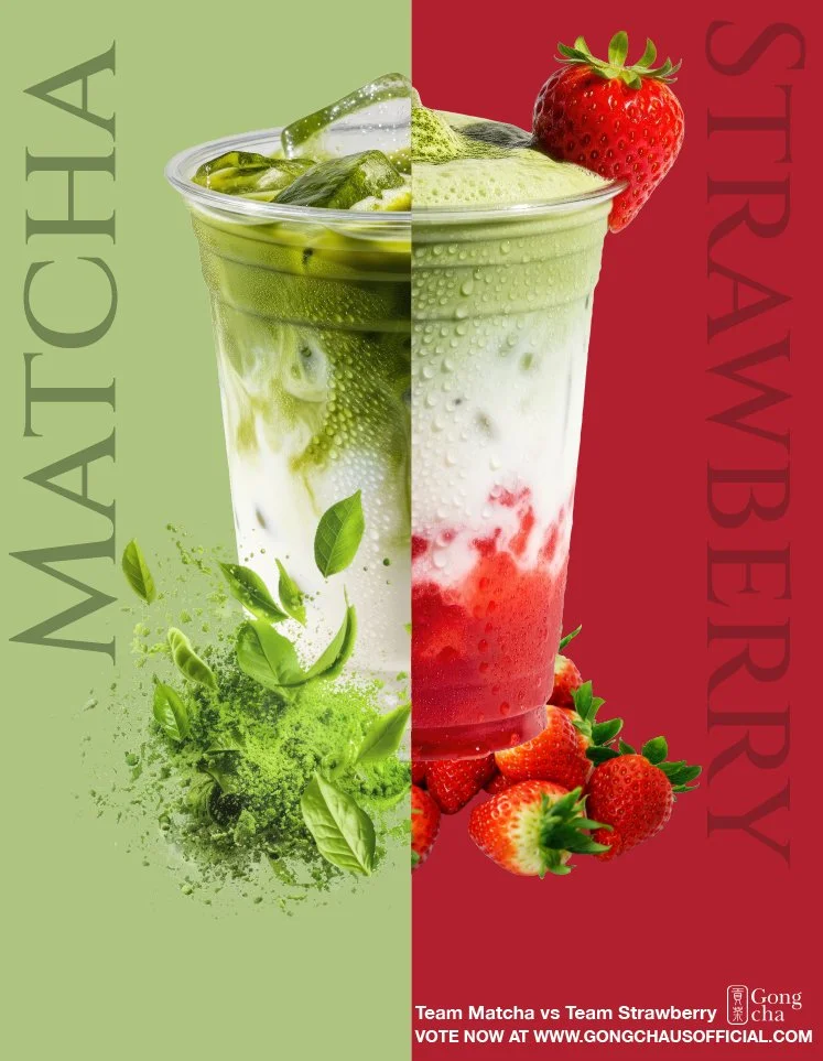
The palette was inspired directly by the drink ingredients. Soft greens reference matcha, rich reds reflect strawberry, and neutral whites support the creamy base of the beverage. Together, these colors create strong contrast while keeping the campaign visually fresh, playful, and product-focused.


Concept Development
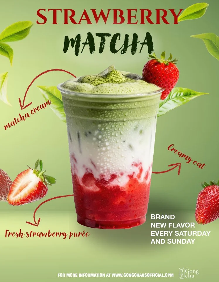
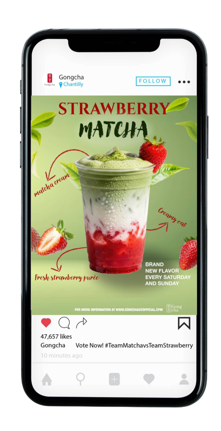
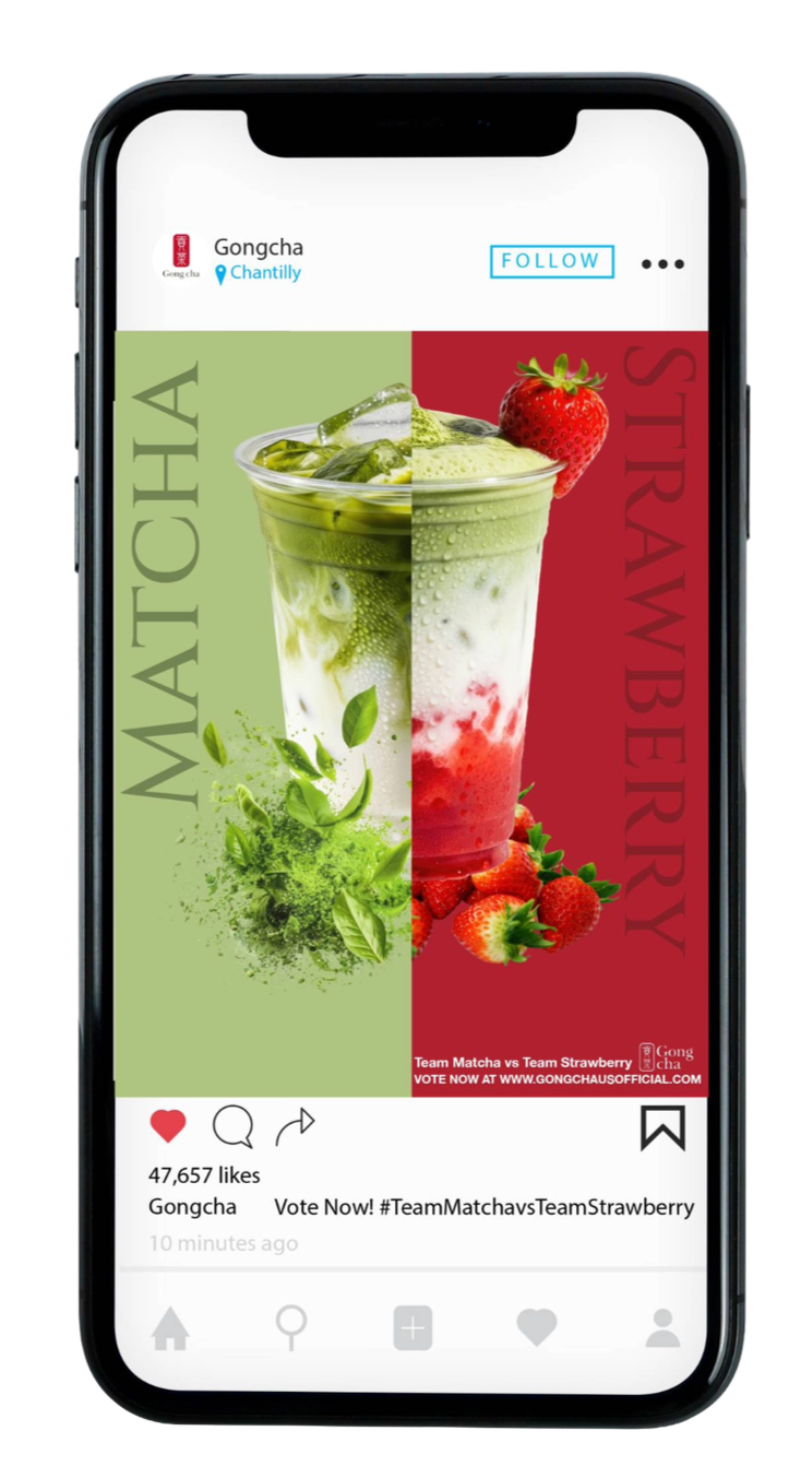
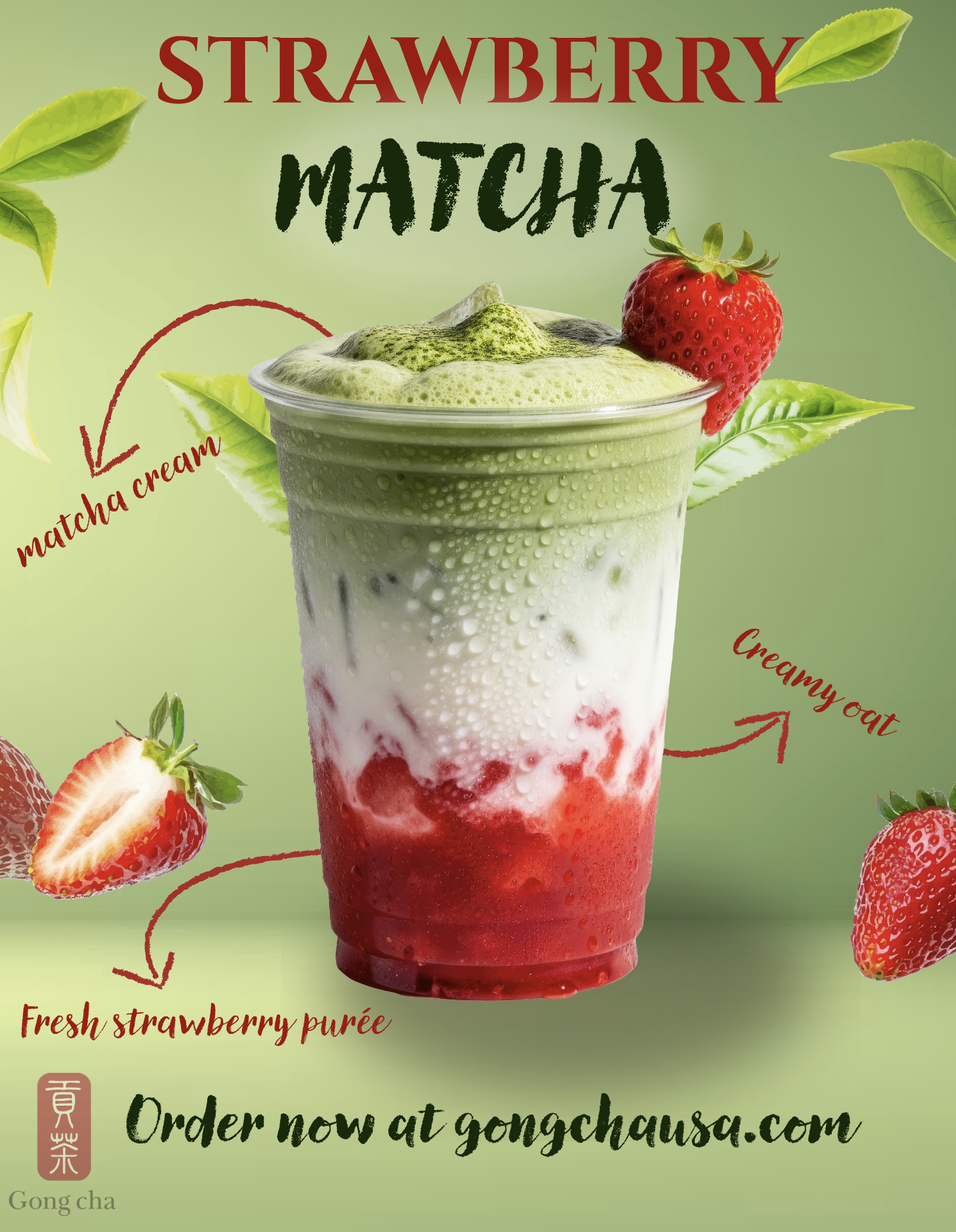
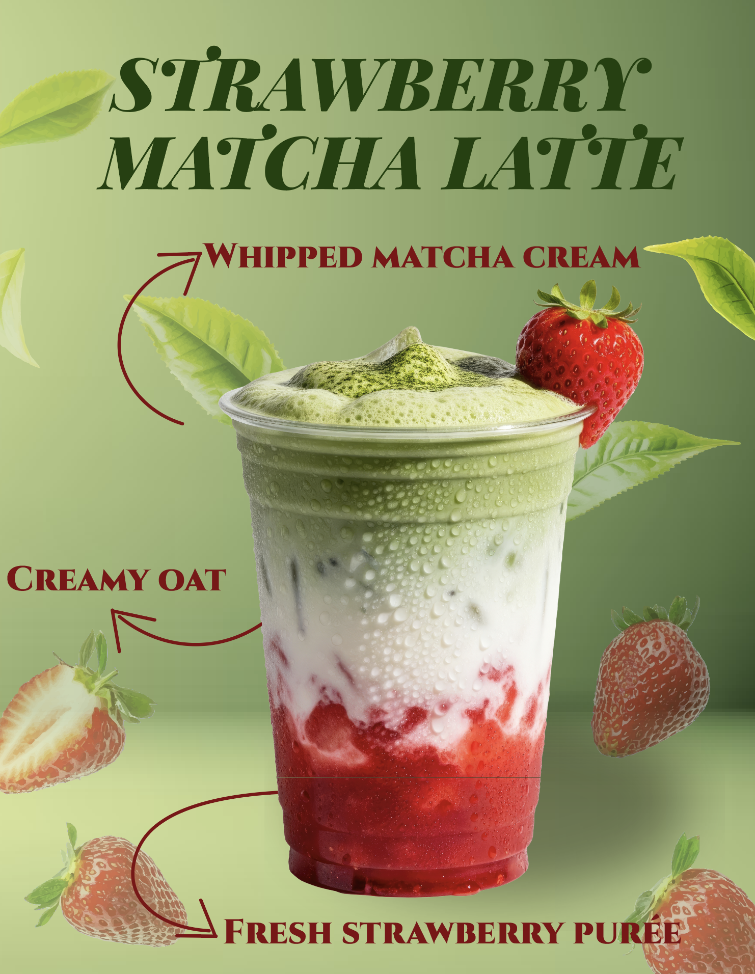
Early campaign explorations tested different ways of presenting the Strawberry Matcha flavor through composition, color blocking, and product emphasis. These variations helped compare a more decorative promotional approach with a cleaner and more graphic direction, making it possible to evaluate which layout communicated the product most effectively.
Design Research
Concept & Message
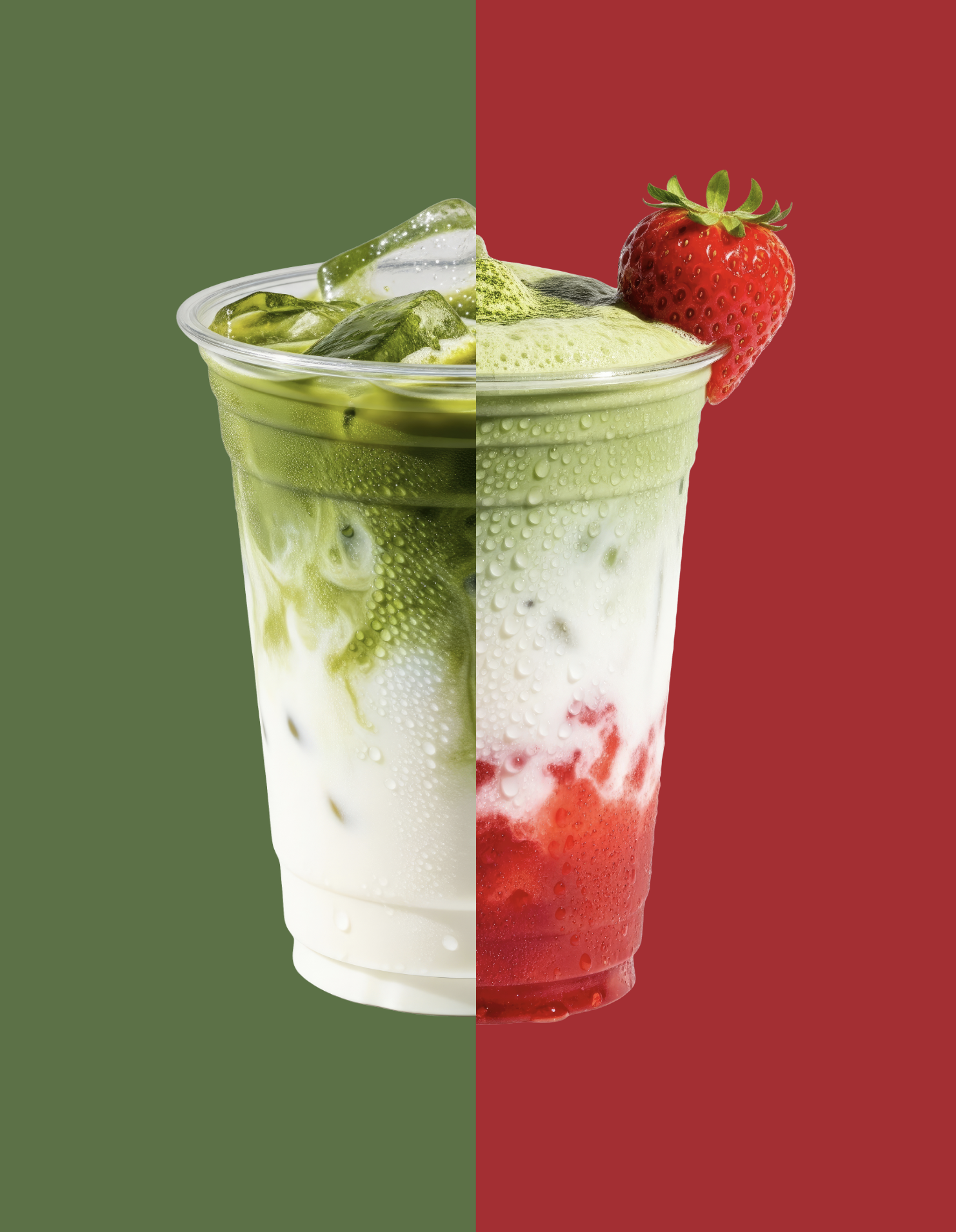
The goal of this campaign was to promote a limited-time Strawberry Matcha flavor in a way that feels fresh, energetic, and visually engaging. The designs were created to highlight the contrast between the two flavors while keeping the drink itself as the main focus. A subtle call to action was also included to encourage interaction without overwhelming the composition.
Layout & Hierarchy
The layouts were built with a clear visual hierarchy:
The drink serves as the dominant focal point.
The flavor names act as the main headline.
Supporting elements such as fruit imagery and callouts guide the viewer’s eye.
Secondary text remains smaller so it supports the design without competing with the product.
Final Outcome
The final campaign explores two distinct visual approaches to promoting the same seasonal drink. One direction uses a cleaner editorial layout with strong contrast and bold type, while the other takes a more descriptive promotional approach with ingredient callouts and added visual cues. Together, these designs demonstrate how typography, color, and composition can shift tone while keeping the product as the central focus.