Jessica Walsh Editorial Spread
Project Overview
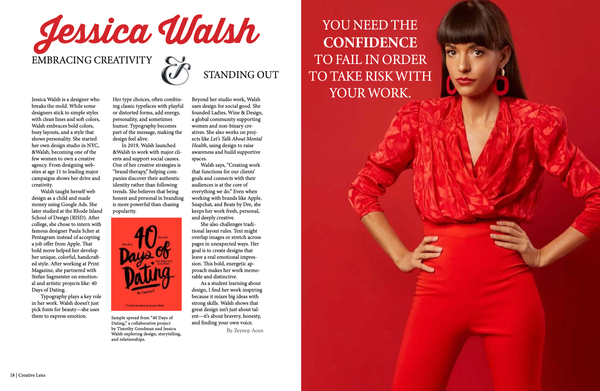
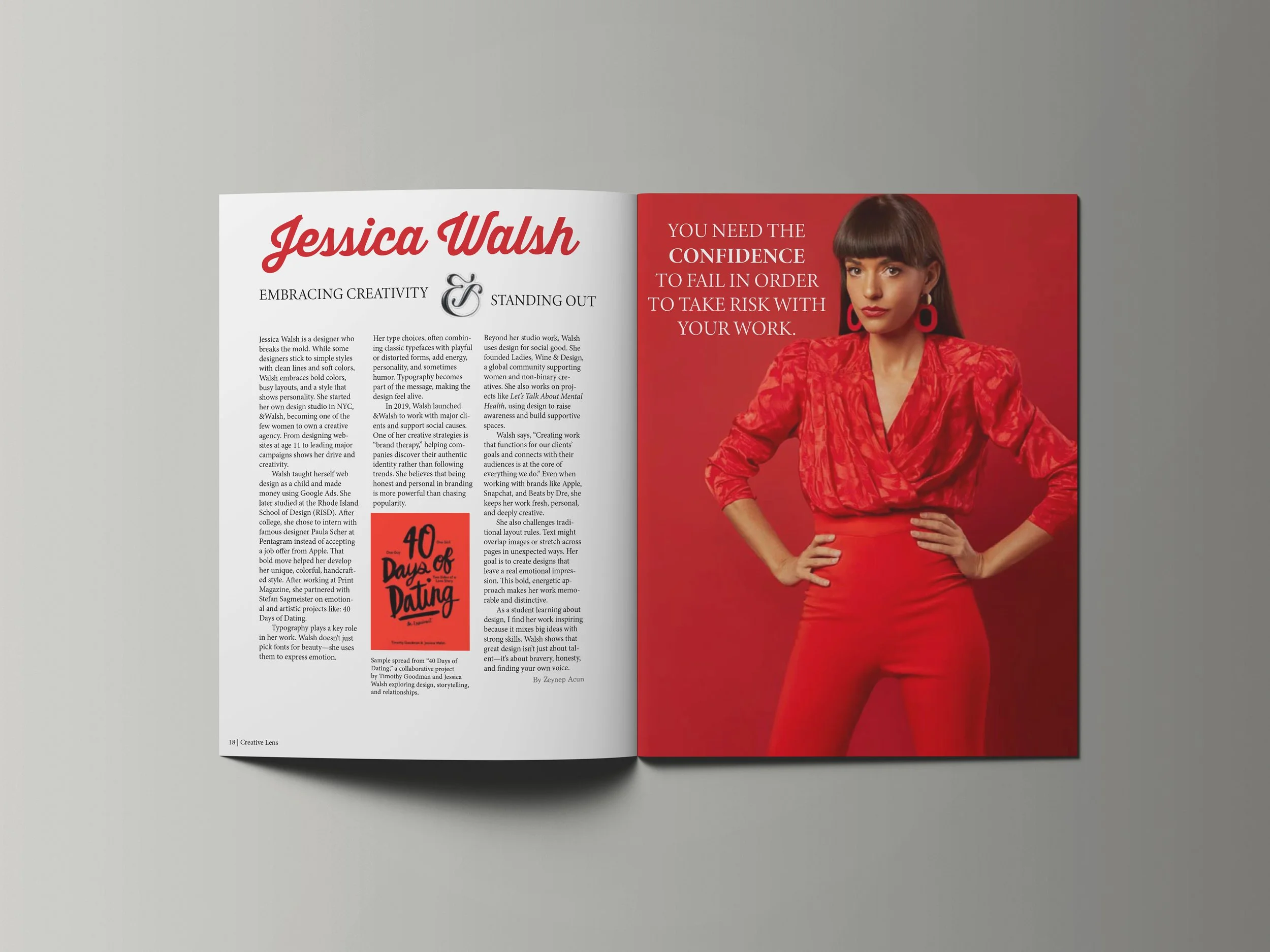
This editorial spread was designed to highlight Jessica Walsh’s bold, expressive approach to design. The goal was to create a layout that reflects her energetic visual identity while organizing biographical and contextual information in a clear and engaging way. Strong contrast, large-scale imagery, and typographic emphasis were used to capture both her personality and the confidence of her work.
Design Direction
The spread was developed to balance readability with visual impact. A strong red palette was used to echo Jessica Walsh’s energetic and recognizable visual style, while the full-page portrait creates a dominant focal point. On the opposite page, a more structured column layout supports the article content and creates contrast with the expressive image treatment.
Typography
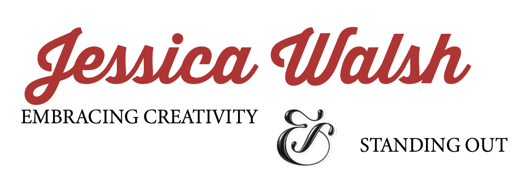
Typography was used to create clear hierarchy while reflecting the personality of the subject. Expressive display type was used for the main title to introduce energy and character, while serif body text supports readability in the article content and subheadings. This contrast helps balance boldness with structure across the spread.
Color Palette
A limited palette centered around red, white, and black was used to create strong contrast and reinforce the bold, confident tone of the spread. The use of red helps unify the imagery and typography while drawing attention to key visual moments.